A brand new lick of paint

Overview
You might have noticed that the site has has a little bit of a glow up, with some of the designs changing fairly significantly!
The reason behind this fresh new look is an underlying tech upgrade. I've moved from a previous platform that Equinote was based on, to a brand new one. The main reason for this change is maintainability.
The old platform wasn't quite up to scratch when I had a look at the features that I needed to implement next. As such, I've taken a little bit of time to get the base of the site up to a good level in order for me to be able to address the next couple of features (more news on these soon).
While the design changes weren't the main focus of this update, I'm happy with how they've turned out and hopefully it genuinely is easier to use. Please do let me know if this isn't the case or if there's things that you miss from the old design.
All of the features that existed before on Equinote are still available and ready to use, so if you were just curious as to why this happened feel free to stop reading now! However I have detailed some of the more significant changes below if you're interested.
Detailed changes
Navigation moved
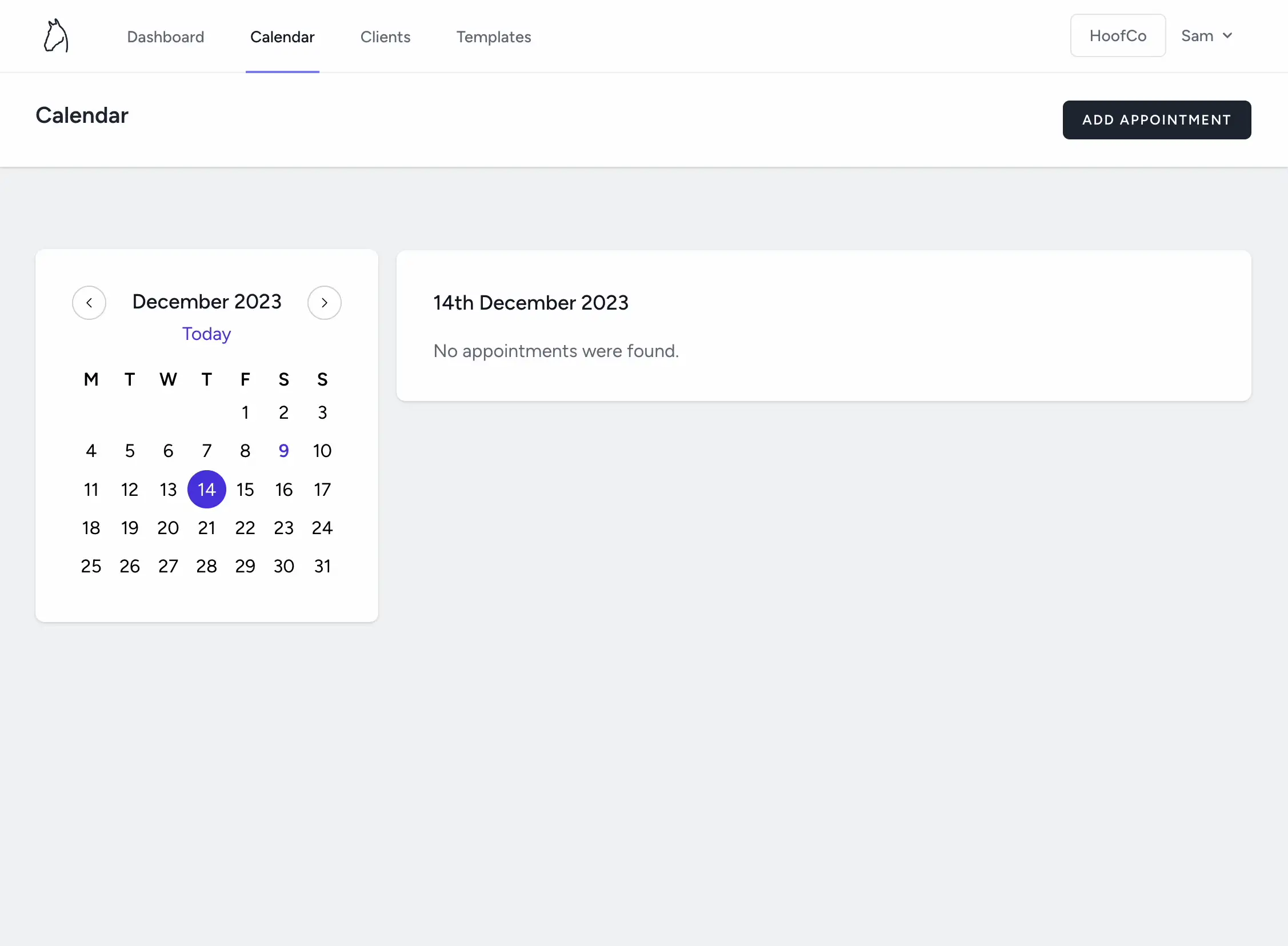
If you're on a tablet, laptop or desktop computer you will see that the main navigation has moved to the top of the screen. This should allow slightly better navigation, but also gives me a lot more screen space to display more information in the future!
Calendar changes
The calendar has changed on all screen sizes, with a much better date picker on mobile and a better layout on desktop. I've moved away from the custom date picker I built to use the in built mobile date picker as it gives a much better experience for selecting new dates.
Previously clicking an appointment would open a short menu with a few options, but will now go through to a new dedicated page showing all of the details. This is needed to allow more options (think invoicing, directly creating the next appointment, etc) and made sense to show this screen from the calendar view or the dashboard.

Archiving and deleting
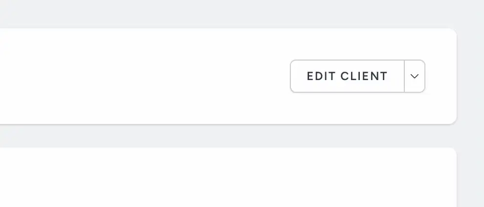
The actions for archiving and deleting clients, horses, and reports, etc have moved to be under the edit button. These were taking up some valuable screen space and could lead to the screen feeling cluttered. They've been moved to a lower priority place, since they're actions that are performed less frequently.

And that's it! That's not all of the changes, but it's some of the highlights, just for reference. Please do let me know of any feedback you may have, but otherwise, thanks for reading!